KOH & KOH WELLNESS
Role: Creative Direction
Agency: Cosmokin Studio
Client: Koh & Koh Wellness
Project Overview
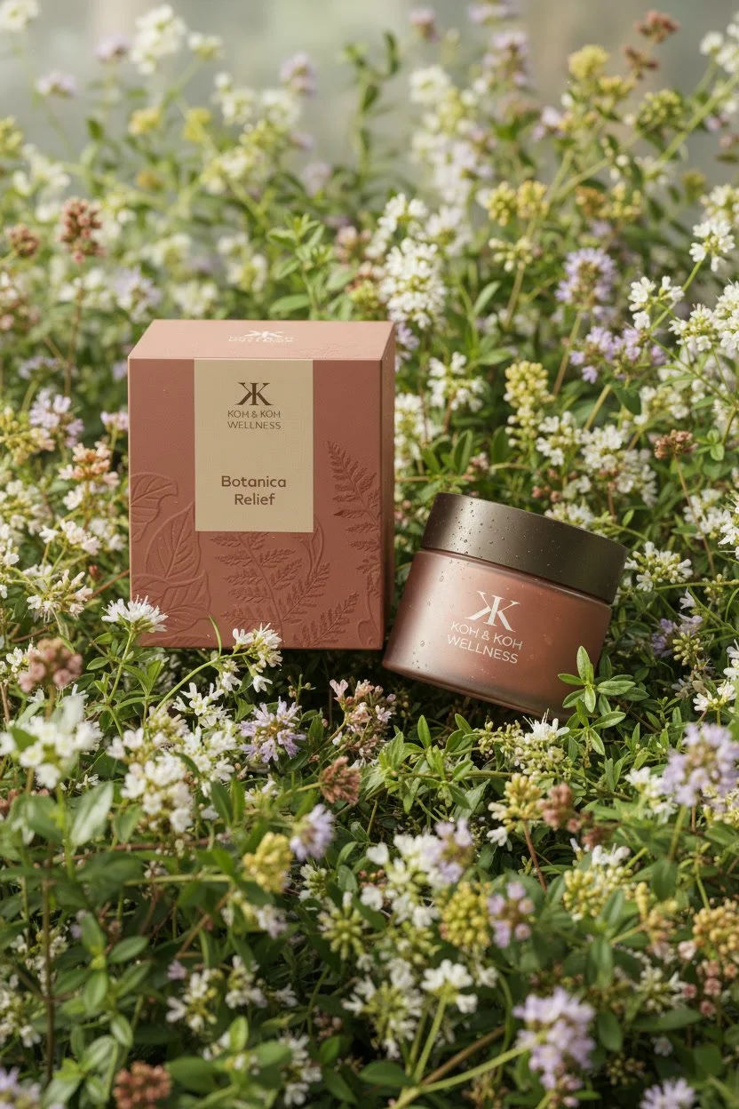
For KOH & KOH Wellness, I crafted a holistic visual identity and product design system grounded in heritage, nature, and modern apothecary aesthetics. At the heart of the identity is a mark inspired by 2 back to back ‘K’ that comes together to form the Chinese character Mu (木 / wood), a symbol of the deep roots, structural strength, and organic growth of this family-run brand. Paired with an earthy palette of terracotta, warm rose, and tactile botanical embossing, the design brings a sense of quiet luxury and grounding purity to every touchpoint.
Brand Identity & Symbolism: Conceptualised the primary logo mark around the Chinese character Mu (木), weaving family lineage, natural stability, and sustainable growth into a clean, modern emblem.
Product & Packaging Design: Designed the structural and visual packaging for the brand’s core product line of restorative balms:
Botanica Relief: Formulated for soothing and calming reactive skin.
Skin Quench: Crafted for deep hydration and barrier protection.
Balance & Root: Developed for structural repair and skin restoration.
Visual & Art Direction: Established the broader brand aesthetics and photography direction, pairing organic floral elements with warm matte finishes to highlight the purity of the natural formulas.